
Data Analysis
Introduction to Data Analysis
Data analysis requires interpretation of results and comparison to relevant theories (or theoretical values). Experimental data is transformed into useful or more desired values. In order to understand the process, it can be helpful to map out how experimental data is related to desired outcomes/results. Usually there are some mathematical manipulations required in order to obtain the desired results (it consists mostly of algebra, logarithms, and exponents). There is a small math review at the back of your textbook. Please be sure that you understand the math relevant to the course; if not, please work with a TA or the instructor. Using a spreadsheet and/or graphing program like Microsoft® Excel can make data analysis and graphing easier and more accurate. This is especially helpful when performing the same calculation many times or when determining best-fit lines to data. TAs and/or the instructor can help you. You should be able to work with fundamental units and the measurement of mass, length, volume, temperature and time, as well as uncertainty, systematic and random error, and significant figures.Uncertainties in Data and Results
Accuracy and Precision
Science is interested in repeatable phenomena and in properties that can be measured both qualitatively and quantitatively. All measurements are uncertain and subject to error, so the result of a single measurement cannot be trusted. Errors can be mistakes (when proper procedure was violated or goofed), and data must be thrown out. Random errors, on the other hand, arise from variations in how you read instruments and handle samples, as well as how the equipment is functioning, from one time to the next. Random errors lead to different results each time you measure the same quantity (sometimes too high; sometimes too low). The closer your measurements agree, the more precise your data. Precision is a measure of how closely a group of measurements agree among themselves. Even if the results of repeated measurements are precise, they are not necessarily accurate. Accuracy is a measure of how closely the reported value agrees with the "true" value of the property. Your best guess at the true value is the average value you measured, which may or may not be very accurate. If the 50-mL volumetric flask used to make solutions actually held only 45 mL, the solutions would all be more concentrated than thought. The results would be inaccurate, even if the precision was deceptively excellent. This is an example of a systematic error, an error built into the equipment or procedure. Systematic errors affect the result the same way each time the measurement is made.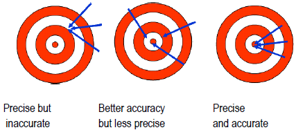
Figure 1
Summary
Precision does not guarantee accuracy, and vice versa. Experiments involve the following.-
1)Random errors, which lead to different values when the same property is measured repeatedly. These errors reduce precision.
-
2)Systematic errors, which can be uncovered by comparing the measured value with a known result or by calibrating the equipment. These errors reduce accuracy.
Significant Figures
Counted and defined quantities are exact and therefore have an infinite number of significant figures. The numerical readings that instruments give are always limited in precision. As you use each instrument, get a sense of the precision it can provide and thus the precision associated with a result. Do not record results that exceed the limit of precision of the instrument. The precision associated with a measurement is often called the uncertainty and is reported as a ± value after the data point or result. For example, the electronic pan balance reads to 0.01 g. If you feel that the mass reading is reproducible to the limit of the balance's accuracy, the uncertainty in a single mass reading would be ±0.01 g. Similarly, with the electronic analytical balance, the uncertainty must be at least ±0.0001 because that instrument reads to only the nearest tenth of a milligram. Record and report only significant figures (digits that mean something). One way to figure out how many significant figures an instrument provides is to make the same reading several times. If you weigh the same object several times and find that your measurements are all within ±0.01 g of each other, you develop confidence in ±0.01 as the precision you get from the balance. If your measurements are within ±0.05 instead, you will know that for you, today, on that balance, you are not getting the expected precision. Not all instruments and equipment read to ±1 of the most precise digit. For example, the level of the meniscus in a 100-mL graduated cylinder can probably only be read to ±0.5 mL. You need to record this value in your notebook, and all values measured using this cylinder can only be reported to ##.0 or ##.5 mL.Significant Figures in Calculations
You must determine how many significant figures to include when performing a calculation. Mathematically, there are rules to use. These are used in the absence of any knowledge of experimental precision (see error propagation). If you add or subtract two measurements, the significant figures in the answer are limited by the measurement with the fewest figures past the decimal point. The number of significant figures in the measurements is not important; the last significant figure in the least precise measurement determines the last significant figure in the answer. If two people weigh 158 and 98 lb, the sum and difference in their weights is 256 lb and 60. lb, respectively (to the ones place). If two objects weigh 12.07 and 7.4 g, the sum and difference of their weights is 19.5 g and 4.7 g, respectively (to the tenths place). If you multiply or divide several measurements, the answer contains as many significant figures as there are in the measurement with the fewest significant figures. If you multiply 1.987 cm × 43 cm, the resulting 85.441 cm2 must be rounded to 85 cm2. The number 43 implies that it might really be 42 or 44. Suppose it was actually 42. The result of 42 cm × 1.987 cm is 83.454 cm2, which is still close to 85. The last three digits have no significance and it would be incorrect to include them. Similarly with division, 1.987 / 43 gives a calculator display of 0.0462093, which must be rounded to 0.046.Mean and Standard Deviation
To overcome the effects of random error, an experiment is usually repeated. If a measurement has been repeated n times and to give the valuesx1, x2, x3,  xn,
xn,
all of the individual measurements aren't reported; instead, the average or mean value, <x>, is calculated. Add all the values and divide the sum by the number of values.
xn, ( 1 )
<x> ≡
≡
| (x1 + x2 + + xn) |
| n |
| 1 |
| n |
| n | xi |
 | |
| i = 1 |
<x> ≡
≡
| (x1 + x2 + + xn) |
| n |
| 1 |
| n |
| n | xi |
| |
| i = 1 |
( 2 )
| σ | ≡ |
| ||||||||
| σ | ≡ |
|


(σ / <x>) × 100%.
( 3 )
σ =
=
= 50
 |
|


|
|
( 4 )
σ =
=
= 1
|
|
|
|
Relative Error and Percent Error
When an average and standard deviation are used, relative error is| σ |
| <x> |
| σ |
| <x> |
Error Propagation
Many times, results are used to calculate the value of some other quantity. How do the uncertainties in values propagate into uncertainties in a calculated result? Calculus is required to find a general answer that works for any calculation. The answers for calculations involving the addition, subtraction, multiplication, and division of two numbers A ± a and B ± b are given below.( 5 )
Addition: (A ± a) + (B ± b) = (A + B) ± (a + b)
( 6 )
Subtraction: (A ± a) − (B ± b) = (A − B) ± (a + b)
( 7 )
Multiplication: (A ± a)(B ± b) = (AB) ± (AB)
+
 |
| a |
| A |
| b |
| B |
 |
( 8 )
Division:
=
±
+
| (A ± a) |
| (B ± b) |
|
| A |
| B |
|
|
| A |
| B |
|
|
| a |
| A |
| b |
| B |
|
-
Volume = Vfinal − Vinitial = 49.06 mL − 12.74 mL = 36.32 mL.
-
Uncertainty in Volume = 0.5 mL + 0.5 mL = 1 mL
( 9 )
R =
=
= 63,226 torr · mL / K · mol
| pV |
| nT |
| (748.6 torr)(1000.0 mL) |
| (0.040 mol)(296 K) |
( 10 )
Fractional uncertainty in R =
+
+
+
= 0.033
| 0.5 |
| 748.6 |
| 0.3 |
| 1000.0 |
| 0.001 |
| 0.040 |
| 2 |
| 296 |
( 11 )
ρ =
=
=
| m |
| V |
| m | ||||
|
| 4 |
| π |
| m |
| π(d)2(l) |
( 12 )
ρerror = ±
+
+
+
| 4 |
| π |
| m |
| (d)2(l) |
|
| μ |
| m |
| δ |
| d |
| δ |
| d |
| λ |
| l |
|
Making and Interpreting Graphs
Graphs, which show how one variable depends on another, are of great value when determining how different properties affect each other. Graphs often highlight relationships among various properties of interest and show information that might not be noticed from a table. Here are a series of helpful guidelines:Step 1
Each pair of experimental values represents a data point for your graph. Decide which values belong on the y-axis and which on the x-axis. Usually the independent variable is plotted on the x-axis and the dependent on the y-axis. For example, pressures can be measured by setting the temperature of a fixed volume of gas. Temperature is the independent variable (x-axis), and pressure is the dependent variable (y-axis).Step 2
Prepare a data table which pairs up each value of the independent variable with the corresponding value for the dependent variable over the entire data range. For example: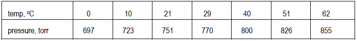
Step 3
Decide on the clearest layout for the graph and determine the ranges for both variables. Here, the ranges extend from 0 to 62°C (just under 65°C) and from just over 690 to just under 860 torr (a range of ~170 torr, not of 855 torr). Values do not have to start at 0 but can start just below the smallest value of the variable in the data. Also, decide what increments to use on each axis. The scales in the two directions do not have to match. Data points should spread out over the whole graph, which should, in turn, cover at least half the page.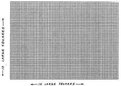
Figure 2
Step 4
Draw the straight lines for the horizontal x-axis and the vertical y-axis. Make tick-marks crossing the axes at equal spacing to show intermediate values of x and of y, ranging from the smallest to the largest values of these variables. If either axis does not go all the way to 0 at the lower left-hand corner of the graph, break the axis just before that corner with a symbol to show that there is a break in the data. [See Figure 3.]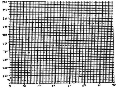
Figure 3
Step 5
Mark a point on the graph for each data pair. [See Figure 4.] If you can estimate the error in each variable, draw a small cross, centered on the point. The height of the cross represents the uncertainty in y; the length represents the uncertainty in x.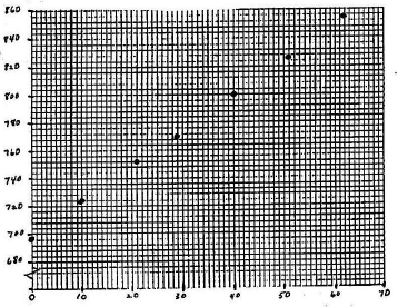
Figure 4
Step 6
Draw the best straight line, the "best-fit line" if the relationship between variables is more or less linear. The majority of your data points should lie close to the line. There are theories of how best to draw this line and computer programs to calculate the line for you (as will some calculators). The equation for a straight line is: y = mx + b, where m is the slope and b is the y-intercept. To find m and b from a straight line: find two well-separated points on your line where it precisely crosses the intersection of two of the graph paper lines (x- and y-values easily read from the graph). Two such points are shown on the graph. The first such point is labeled x1, y1, and the second is labeled x2, y2. The slope is the change in y over the change in x (the difference between y2 and y1 divided by the difference between x2 and x1). This is often described as the change in y over the change in x or the "rise over run". Once you know m, find b by solving the equation b = y – mx for an easily-read (x, y). The resulting equations are shown below.( 13 )
m =
| y2 − y1 |
| x2 − x1 |
( 14 )
b = y1 −
x1
|
| y2 − y1 |
| x2 − x1 |
|
Step 7
Label each axis neatly (property and units). Also put a title on your graph, such as "Pressure Versus Temperature for Air Sealed in a One-Liter Tank."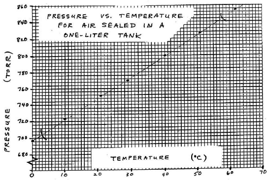
Figure 5
Plots of nonlinear relationships
Sometimes the experimental theory suggests that your plot not be so simple as just p against T. Instead, you may need to plot some function of p against some function of T. For example, if the theory related p to T (given in Kelvins, not Celsius) through the following equation.( 15 )
log p =
+ b
| a |
| T |
( 16 )
y = mx + b
