
Data Analysis for Physics Labs
You have a number of software options for analyzing your lab data and generating graphs with the help of a computer. Since Microsoft Excel is widely available on all CCI laptops and in ATN computer labs, you are encouraged to use this spreadsheet program to analyze your data. A brief tutorial on using Excel for data analysis is included in this lab manual. Another graphical analysis program called KaleidaGraph is also available, but with limited access (there is not a campus-wide site license for this program). KaleidaGraph is available on the computers in the lab rooms (for your use during lab), in Phillips 245, and in the student computer labs throughout campus (in the physics folder). Instructions for using KaleidaGraph can be found on the lab website. A third software option is PASCO's DataStudio, which is used in the introductory chemistry lab courses and should be available across campus. You may use whichever software program you prefer, but it is your responsibility to ensure that the computational results are correct and consistent with the requirements stated in this lab manual.
No matter which program you use, the section titled Determining the Uncertainty in Slope and Y-intercept may be useful to you.
Using Excel for Data Analysis
Getting Started
This tutorial will lead you through the steps to create a graph and perform linear regression analysis using an Excel spreadsheet. The techniques presented here can be used to analyze practically any set of data you will encounter in your introductory physics lab. To begin, open Excel from the "Start" menu on your PC (Start > Programs > Microsoft Excel). A blank worksheet should appear. Enter the sample data and column headings shown in Figure 1 into cells A1 through B6. Save the file to a disk or to your personal file space on the campus network. (To do this, click on "File" and choose the "Save As" option.) You will be creating a graph of this data, similar to the one shown in Figure 1.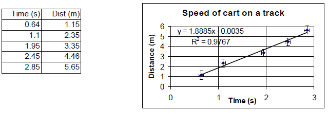
Figure 1
Creating and Editing a Graph
Use your mouse to select all the cells that contain the data that you want to graph. To graph this data, select "Chart" from the "Insert" menu (or click on the "Chart Wizard" icon that should be visible on the toolbar). You will see a series of dialog boxes.
Step 1: Choose "XY (Scatter)" with no lines, and click "Next."
Step 2: This screen allows you to choose which data to plot. Since you did this before starting the Chart Wizard, just click "Next."
Step 3: This screen has multiple menus. Experiment with the settings to see what they do. Make sure your final graph has a descriptive title, axes that are labeled (with units), and no legend. When you are done, click "Next."
Step 4: This screen selects where you will store the graph. Choose "As object in" to store the graph in the same worksheet as the data and click "Finish."
Adding Error Bars
Right-click on a data point and choose "Format Data Series..." Click on the "Y Error Bars" tab. Choose "Both" under "Display" and "Fixed Value" under "Error Amount". Then enter the uncertainty for the y-values in the box marked "Fixed Value." You can add "X Error Bars" in a similar manner. Note: Error bars may not be visible if they are smaller than the size of the data marker.Adding a Trendline
The primary reason for graphing data is to examine the relationship between the two variables plotted on the X- and Y-axes. To add a trendline and display its corresponding equation, right-click on a data point and choose "Add Trendline." Choose the graph shape that best fits your data and is consistent with your theoretical prediction (usually Linear). Click on the "Options" tab and check the boxes for "Display equation on chart" and "Display R-squared value on chart." A good fit is indicated by an R2 value close to 1.0.
Caution: When searching for a mathematical model that explains your data, it is very easy to use the trendline tool to produce nonsense. This tool should be used to find the simplest mathematical model that explains the relationship between the two variables you are graphing. Look at the equation and shape of the trendline critically: Does it make
sense in terms of the physical principle you are investigating? Is this the best possible explanation for the relationship between the two variables? Use the simplest equation that
passes through most of the error bars on your graph. You may need to try a couple of trendlines before you get the most appropriate one. To clear a trendline, right-click on that regression line and select "Clear."
Determining the Uncertainty in Slope and Y-intercept
The R2 value indicates the quality of the least-squares fit, but this value does not give the error in the slope directly. However, the standard error (uncertainty) in the slope m can be determined from the R2 value by using the following formula:( 1 )
σm = m
 |
|


y = mx + b,
with n data points.
The uncertainty in the y-intercept b is the following.
( 2 )
σb = σm
 |
|
σm = 0.1684 m/s,
and σb = 0.333 m.
The uncertainty in the slope and y-intercept can also be found by using the LINEST function in Excel. Using this function is somewhat tedious and is best understood from the Help feature in Excel.
Interpreting the Results
Once a regression line has been found, the equation must be interpreted in terms of the context of the situation being analyzed. This sample data set came from a cart moving along a track. We can see that the cart was moving at nearly a constant speed since the data points tend to lie in a straight line and do not curve up or down. The speed of the cart is simply the slope of the regression line, and its uncertainty is found from the equation above:v = 1.9 ± 0.2 m/s.
(Note: If we had plotted a graph of time versus distance, then the speed would be the inverse of the slope: v = 1/m)
The y-intercept gives us the initial position of the cart: x0 = −0.0035 ± 0.33 m,
which is essentially zero.