Frequency and Relative Frequency
In general, the distribution of a variable describes how often the possible responses occur. A frequency distribution for a categorical variable is a listing of all categories along with their frequencies (counts). A relative frequency distribution is a listing of all categories along with their relative frequencies (given as proportions or percentages). The relative frequency for a given category is computed by dividing the number in that category by the total across all categories. Multiply by 100% to convert the relative frequency to a percentage.
Bar Graphs
Bar graphs are useful for summarizing one or two categorical variables. They are particularly useful for making comparisons when there are two categorical variables. This bar graph below shows the frequencies on the vertical axis and the possible response categories on the horizontal axis.
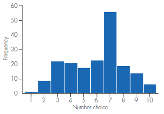
A bar graph has a horizontal axis labeled "Number choice" with values from 1 to 10 and a vertical axis labeled "Frequency" with values from 0 to 60. The bar chart has 10 bars. Each bar is associated with a label and an approximate value as listed below.
- 1: 1
- 2: 9
- 3: 22
- 4: 21
- 5: 18
- 6: 23
- 7: 56
- 8: 19
- 9: 14
- 10: 6
Graphing with SALT
Click "Use SALT" to access SALT. The exercise dataset will be automatically imported into the tool. To create a bar graph, navigate to the Charts and Graphs tab. Select "Bar Chart" from the list of available charts and graphs.
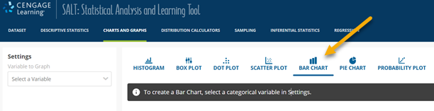
The top menu bar of the SALT progam is shown. The tab labeled "Charts and Graphs" is shown and highlighted. The tab labeled "Bar Chart" is highlighted and has an arrow pointing to it.
Select the variable for which the bar chart should be generated. Choose the "Relative Frequency" option to use the relative frequency distribution and click "Recalculate Graph."
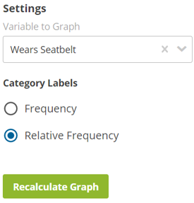
A menu in the SALT program labeled "Settings" is shown. The menu contains a drop-down menu labeled "Variable to Graph" that shows the text "Wears Seatbelt." Below the drop down menu is a pair of radio buttons labeled "Category Labels." The two radio buttons are labeled "Frequency" and "Relative Frequency" with "Relative Frequency" selected. Below the radio buttons, there is a button labeled "Recalculate Graph."
The bar chart will be displayed in the main graphing window. A table of frequencies and relative frequencies will be shown below the bar chart.