
Appendix G: Using Excel to Create a Graph with Error Bars
You can use Excel to create graphs and add error bars, labels, trendlines, etc. To create a simple scatter plot with error bars follow these steps.Creating a graph
1
Enter your data in an Excel spreadsheet as shown in Fig. 1.
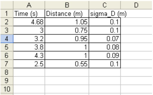
Figure 1: Entering your data
2
Label your columns with names and units.
3
Highlight the data that you want to graph, as shown in Fig. 2.
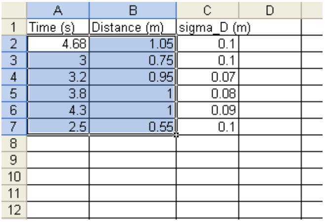
Figure 2: Highlighting data to be graphed
4
Click the Insert tab at the top left of the Excel window (or click the chart icon in the horizontal tool bar).
-
•Click the "Scatter" icon.
-
•Click the picture of a graph with just the points (no lines) as shown in Fig. 3.
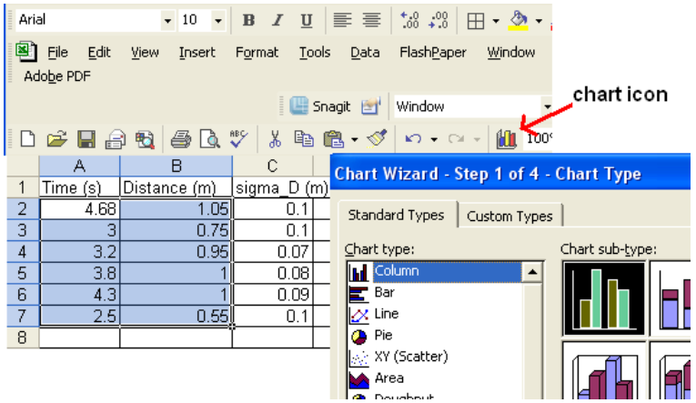
Figure 3: Choosing your graph
5
Your graph should appear as seen in Fig. 4.
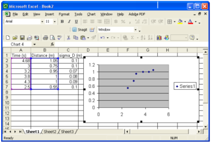
Figure 4: Inserting your graph
Adding error bars
6
To add error bars, right click one of the points in the graph.
-
•Select "format data series."
-
•A window as shown in Fig. 5 will appear.
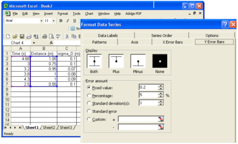
Figure 5: Error bar menu
7
Click on the 'Y Error Bars' tab if it is not already selected.
-
•Click 'Both' for display option and 'Custom' for error amount.
-
•The cursor will automatically appear in the '+' next to 'Custom'.
-
•Select cells C2 through C7 and you will see these cells listed in the '+' box for the positive errors for each data point. See Fig. 6.
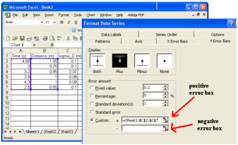
Figure 6: Entering values for error bars
8
Select the '–' error bar box and once again select cells C2 through C7.
-
•Click 'OK' to complete this step.
-
•Your graph will now have error bars as shown in Fig. 7.
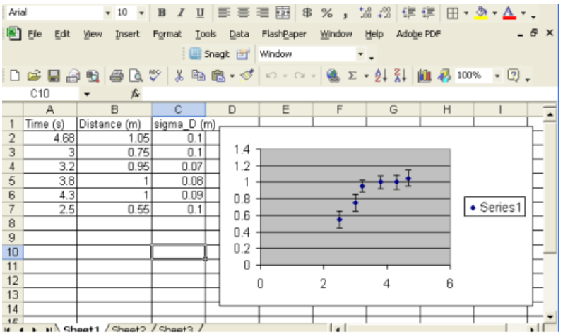
Figure 7: Graph with error bars added