
Physics Lab Introduction
Welcome to the KET Physics lab program. The labs you'll be doing have been designed to teach you good lab technique while giving you direct experience with the phenomena you're studying in the course. You're also encouraged to use the virtual lab apparatus outside of the regular guided lab program to help you answer your own questions. Hopefully you'll enjoy working with this virtual apparatus. The 21-piece apparatus collection was designed and developed at Kentucky Educational Television (KET) by Nathan Pinney, Brian Vincent, Tim Martin, and Chuck Duncan. The labs, that is, the lab activities, were written by Chuck Duncan. Work continues on both fronts. A video introduction for each piece of the apparatus is available at http://virtuallabs.ket.org/physics/apparatus/. To access the video for the apparatus you'll be working with, just click on its image on that page. On the page that opens you'll see "Watch: Video Overview." Click that link to view the video overview. These do not include sound. You will use this Introduction in three ways.-
1You may be asked to use it as a lesson to complete before you do your first lab. There are a number of activities contained in this introduction, and for best results, you should complete all of them. Plan on two to three hours for this.
-
2You will use it as a reference when you're asked to do certain things in the lab. For example, you'll be asked to find percentage errors. That's explained in Section 1.4, and you'll learn (or review) that calculation when you study that section.
-
3You will use it to learn how to use the Grapher software, which is supplied as part of the lab program. Instructions on the use of the built-in Sketch tools are also provided.


-
•For these introduction activities, click this link to open the Grapher.
-
•In WebAssign, any lab that uses Grapher will include a link which will open Grapher in a new tab.
-
Will Lab Work Be on the Test?
Your physics course will teach you many concepts and techniques that will help you understand and work with the physical world. Your regular course instruction, your labs, and your homework work together to that end. Depending on the course you're in, you may or may not be asked specific lab-related questions on your tests. But you'll be enhancing your understanding of course concepts in the lab, and this is very likely to have a positive effect on our test results.Contents
-
1 – Errors and Uncertainty
-
1.1 – Types of Error
-
•Instrument Limitations
-
•Random Error
-
-
1.2 – Precision and Accuracy
-
•Systematic Error
-
- 1.3 – Uncertainty of Measurement
-
1.4 – Significant Digits (Figures)
-
•Identifying Significant Digits
-
•Significant Figures as a Result of Calculation
-
•Rounding
-
- 1.5 – Percentage Error and Percentage Difference
-
1.1 – Types of Error
-
2 – Graphical Analysis; Working with Grapher
-
2.1 – Graphs and Equations
-
2.1.1. – Definitions
-
•Mathematical Models
-
•Dependent and Independent Variables
-
•Data Tables
-
-
2.1.2 – Creating an Equation by Linearizing Data
-
•Line of Best Fit
-
•Least Squares Fit
-
•Slope
-
•y-intercept
-
- 2.1.3 – Capturing Graphs and Sketches for Uploading in WebAssign
-
2.1.1. – Definitions
-
2.2 – Interpreting Graphs
- 2.2.1 – No Relation
- 2.2.2 – Linear Relation with y-intercept
- 2.2.3 – Direct Proportion
- 2.2.4 – Inverse Proportion
-
2.2.5 – Square or Quadratic Proportion
-
•Side-Opening Parabola
-
•Top-Opening Parabola
-
- 2.2.6 – Graphical Analysis Summary
-
2.1 – Graphs and Equations
Are You a PC or a Mac?
The lab apparatus and Grapher software will run on either a Windows or Mac computer. But the two sometimes handle some things differently. Here's one to be on the lookout for. Windows computers have at least two mouse buttons: a left and a right, and sometimes a middle one. If you're told to click on something, this means to move your pointer over it and click with the left button. We'll say right click when we mean to use the right button. A right click usually brings up a menu of choices to select from. Some Macintosh computers have just one button. It's equivalent to a regular (left) click. A Ctrl+Click (holding down the control key and clicking) is equivalent to a right click.1 – Errors and Uncertainty
As you'll discover in this course, physics is mostly about events, that is, things that happen.-
•A baseball is hit and travels along an arc or along the ground and the fielder has to get to the right place at the right time to catch it.
-
•Billiard balls collide at various angles and you can somehow predict which way they'll go.
-
•The tea I'm making right now will melt most of a glass of ice if I don't wait five minutes before I pour it in
-
•The length of time between phone recharges depends on the screen brightness, amount of use, etc.
-
•The damaging effect of light depends on how much of various wavelengths are involved.
1.1 – Types of Error
Our measurements are limited in two ways: instrument limitations and random uncertainties, or random errors. Instrument limitations: Our measuring devices have limits to how finely they can divide up a quantity. The finest graduation on a meterstick is a millimeter. We can use it to measure to within some fraction of a millimeter, but not beyond. We would say that one millimeter is the resolution of a standard meterstick. If we removed the millimeter marks, leaving centimeter graduations, we would decrease its resolution to one centimeter. Thus, we would reduce its resolution by a factor of ten. Random (indeterminate) errors: When you measure the length of an object with a meterstick, you have to judge when the object and meterstick are aligned properly and which points on the meterstick align with each end of the object. If you made the same measurement several times, you'd get slightly different results, ranging by some amount either side of some central value. This type of random variation is inherent in any measurement, but the average of many such measurements would be a good indication of the "correct" value. What about human error? This is not actually a scientific term. The two types of limitations mentioned above are normal parts of any scientific measurement and we can deal with them in standard ways as you'll see. But "I didn't realize that I was using a yardstick and not a meterstick" is just a mistake. We'd deal with it by repeating the experiment with the proper tool. So just eliminate that term "human error" from your scientific vocabulary.1.2 – Precision and Accuracy
To its extreme embarrassment, precision's definition varies according to the context of its use. In physics, we generally use the term in two ways.-
1Precision is the degree of agreement among several measurements of the same quantity; the closeness of repeated measurements to the same value; the reliability or reproducibility of a measurement. Note that precision is unrelated to the correctness of a measurement. If you shoot at a target several times and all the arrows are close together, you're a precise shooter. If the arrows are again tightly grouped but actually in the wrong target, you're a precise but inaccurate shooter. You may see precision expressed like this: 2.04 ± 0.05 m. This would indicate that your average value for several measurements was 2.04 and that the measurements were spread over a range between 1.99 m and 2.09 m. So you feel confident that any subsequent measurement would fall into that range. A less precise measurement of the same object might be written as
2.04 ± 0.1 m. And 2.04 ± 0.02 m would be more precise. -
2Precision is the measure of how exactly a measurement is made; the number of significant digits to which it can be measured reliably. According to a plastic ruler, a nickel is about 2.10 cm in diameter. If I use a device called a vernier caliper, I can measure more precisely. I might find the diameter to be 2.096 cm. The extra digit indicates the greater precision of the instrument being used.
10 m × 10 m area on Mars illuminates just one pixel on the digital camera's light-gathering chip. So if the light from that area is reddish on average, the pixel will be reddish. A similar effect is found with your eyes. As you approach a distant object the image spreads over a larger area on your retina, increasing the resolution of the image, letting you resolve smaller objects. For example: "I see a beach." "Now I see sand." "Now I see that the sand is multicolor and jagged." "Help me up!" Closely related to precision is accuracy. Accuracy is the degree of closeness of a measured or calculated quantity to its actual (true) value; the extent to which the results of a calculation or the readings of an instrument approach the true values of the calculated or measured quantities. The results of calculations or a measurement can be accurate but not precise, precise but not accurate, neither, or both. This may be better understood by an analogy. Consider several attempts by a marksman to hit a bull's eye. If the bullets all hit in a tight pattern, we'd say that the shooting is very precise. This would be true even if the tight cluster is far from the bull's eye. If that tight cluster was centered on the bull's eye, we'd say that the shooting was both precise (definition 1) and accurate. If the cluster was not so tight, but still centered on the bull's eye, we would say that the shooting was accurate, but not precise. We won't be doing any shooting in the lab, but we will be making multiple measurements of quantities. If our repeated measurements of a quantity are nearly the same (precise) and approximately equal to the "correct" value (accurate), we'd say that our measurements are both precise and accurate. A result is called valid if it is both accurate and precise. Incidentally, the shooter whose bullets hit in a tight cluster away from the bull's eye would be said to have a systematic error in his shooting. What would the judges in that event have to say about this? "Sorry buddy, we don't forgive the 'human error' of the choice of an inadequate weapon, or the improper adjustment or use of the gun sight. You lose." Systematic errors are not related to uncertainty. They indicate that you've done something incorrectly and need to correct the source of the error and retake your data. For example, if you were weighing liquids in a beaker and forgot to subtract the weight of the beaker, all your values would be off by an amount equal to the weight of the beaker.
1.3 – Uncertainty of Measurement
All scientific measurements are made by comparison to some accepted standard. The length of the spine of a book is compared to markings on a standard meterstick; the time for a ball to fall some distance is compared to the seconds ticked off on a stopwatch, etc. When I asked a visitor to my house how tall he was, he responded "2 meters, 4 centimeters." Was this tall Scandinavian exactly 2.04 m tall? Who knows. He was just really tall and that's all that I was curious about. But as a scientific measurement, 2.04 meters means something very specific. If we recorded a measurement of the distance that a rock had fallen as 2.04 m, this value would mean that we were confident that it fell some distance between 2.00 m and 2.10 m and that 4 (cm) is our best guess of the final digit. We will always use this system when we take data. Here's the rule:
You should always measure as many digits as you can with certainty and then estimate one more digit.
12.72 cm. We'll record the book's length as (12.72 – 6.14) cm = 6.58 cm or 0.0658 m. Note that our answer gives the magnitude of our measurement as well as an indication of the uncertainty of our measurement. We are confident to within 0.1 cm and estimate another digit. (This alignment of the instrument is really pretty terrible. Perhaps this is an example of that favorite scapegoat human error!)
Figure 1: Measuring Length with a Meterstick
1.4 – Significant Digits (Figures)
In the two examples above, the uncertainty of our measurements (hundredths (2.04 m) and ten-thousandths of a meter (6.58 cm)) has been clearly indicated by the digits we recorded. This is standard practice and you'll always use this system in your lab work. All you do is write down every digit you measure, including an estimated digit, and you're done. These measured digits, including the estimated digits, are referred to as significant digits. There is a bit of confusion involving zeroes since a zero can indicate either a measured value (significant) or be placeholders (non-significant). So let's look at how we deal with them. Identifying Significant Digits
Rule 1. Non-zero digits are always significant.
-
•Example: 3.562 m – all four digits are significant
Rule 2. Embedded zeros are always significant.
-
•Example: 2.05 cm – you estimated the 5 hundredths of a centimeter after measuring the 0 tenths of a centimeter with certainty, so the zero is certainly significant. This measurement has three significant digits.
Rule 3. Leading zeros are never significant.
-
•Example: 0.0526 m – just three digits are significant. Leading zeros are just placeholder digits. If you measured 0.0526 m in centimeters, you'd write 5.26 cm. The units used should not change the number of significant digits. This number has three significant digits.
Rule 4. Trailing zeros are always significant.
Significant Figures in the Result of a Calculation
In addition to making measurements to the proper precision, we also have to attend to significant digits when making calculations. There are basically two situations to be concerned with. Here's an example of each. Calculate what you think the answers are. We'll return to these questions shortly.
-
•This is where it gets tricky. Look at the following three scenarios to see why. The last two show how to deal with two different situations. A convention is used to prevent ambiguity.
-
•Example: 4.570 m – the zero comes to the right of a decimal point. You wouldn't include the zero unless you measured the last digit as a zero, since 4.57 m is the same amount as 4.570 m. So you only needed to include the zero to indicate your estimate of the number of millimeters (0) after measuring the certain value of 7 cm.
-
•Example: 4570 m – all four digits are significant, since you measured three and estimated the zero. In this case, you measured the 4, then the 5, then the 7, and then estimated that the last digit was zero. It's no different than, say, 4572. The last digit was the estimated digit and just happened to be zero.
-
•Example: 4570 m, but you measured the same object with a less precise instrument. So it's the same size measurement as the previous example, but the seven was the estimated digit, and the zero is just a placeholder. So you really have only three significant digits. Well, rules are rules. If that trailing zero is not significant, you have to get rid of it. Here's how: if you need some trailing zeros for placeholders, use scientific notation or metric prefixes instead. Solution 1:4.57 × 10³m Solution 2: 4.57 km Got that?
-
•If you record 4570 m, then by convention, we know that the zero was a real measurement—your estimated digit.
-
•If you didn't really measure the final zero, that is, the 7 was your estimate, by convention, you can't include the zero. So you use scientific notation or the equivalent—metric prefixes—to indicate the location of the decimal point.
-
-
•Example 1: Suppose you measured the inner diameter of a pipe to be 2.522 cm and the length to be 47.2 m. What would you list as its internal volume?
-
•Example 2: A truck that weighs 32,175 pounds when empty is used to carry a satellite to the launch pad. If the satellite is known to weigh 2,164.015 pounds, what will the truck weigh when loaded?
-
•Example:2.53 × 1.4 → 3.542on the calculator 1.4 has the fewest significant digits (two). So we use two significant digits in our answer. Answer: 3.5
-
•Example:2.53 + 1.4 → 2.5 + 1.4
| 2.53 | → | 2.5 |
| 1.4 | → | 1.4 |
| 3.9 |
V = πr2h = π
cm
(4.72 × 103 cm) = 23,578.8 cm2
 |
| 2.522 |
| 2 |
 | 2 |
V = 2.36 × 104 cm2.
Now re-try example 2.
| (32,175 + 2,164.015) lb | = | 32,175 | → | 32,175 | |
| → | 2,164 | ||||
| 34,339 | lb |
Rule 1: If the digit immediately to the right of the nth digit is less than 5, the number is rounded down.
-
•Example 1: Rounding 2.434 to two significant digits becomes 2.4 after dropping 34.
Rule 2: If the digit immediately to the right of the nth digit is greater than 5, the number is rounded up.
-
•Example 2: Rounding 2.464 to two significant digits becomes 2.5 after dropping 64.
Rule 3: If the digit immediately to the right of the nth digit is 5 and there are non-zero digits after the 5, the number is rounded up.
-
•Example 3: Rounding 2.454 to two significant digits becomes 2.5 after dropping 54.
Rule 4: If the digit immediately to the right of the nth digit is 5 and there are no subsequent non-zero digits, round the number in whichever direction leaves the nth digit even.
-
•Example 4a: Rounding 2.450 to two significant digits becomes 2.4 after dropping 50. The result was left as 2.4 since 2.450 is closer to 2.4 than 2.6.
-
•Example 4b: Rounding 2.550 to two significant digits becomes 2.6 after dropping 50. The result was increased to 2.6 since 2.550 is closer to 2.6 than 2.4.
1.5 – Percentage Error and Percentage Difference
In the lab, we will often try to determine the value of some "known" or theoretical quantity—the speed of light in a vacuum, the wavelength of light given off by an electrical discharge through a certain gas, or the acceleration of an object falling without friction. One way of comparing our experimental result with the theoretical value is calculating a percentage error between the theoretical and experimental value. The error between the theoretical and experimental values is just the absolute value of their difference. We can get a better measure of the significance of our error by comparing it to the theoretical target value. We can do this by calculating a percentage error.-
•Example: The accepted value for the acceleration due to gravity is 9.82 m/s2 at a certain location. In the lab, a student measures it as 9.91 m/s2.
error = |9.82 − 9.91| m/s2 = 0.09 m/s2
percentage error =
× 100% = 0.916%
| 0.09 m/s2 |
| 9.82 m/s2 |
-
•Example: The speed of sound is determined in two different ways, once by measuring the time for a sound to bounce off a nearby building, and then by setting up standing waves in a tube. The two results are 318 m/s and 340.6 m/s. While the second is measured to greater precision, we have no way of knowing how accurate either result is.
percentage difference =
× 100% = 6.86%
| |318 − 340.6| | ||||
|

2 – Graphical Analysis; Working with Grapher
As you work through this section you need to create all the graphs described using Grapher. You'll be making your own graphs in the lab soon and uploading them as part of your lab reports. There is more information about using Grapher in section 3.
2.1 – Graphs and Equations
In sections 2.1–2.15, many examples of the use of Grapher will be illustrated. It is essential that you do every example as it's presented. You'll be using all these techniques frequently this year, so it's crucial that you learn the process now. The instructions below will also guide you in creating hand-drawn graphs.
2.1.1 – Definitions
Much of what we do in physics involves finding relations between quantities. These relations are best described using mathematical models—equations that relate the quantities. E.g., speed = distance/time. Probably the most well-known and important such mathematical relation involves pizza. Years of study in the laboratory has determined that doubling the diameter of a circular pizza quadruples its area. The inability of consumers to unravel this relation, thus allowing them to understand the pricing, is surely the reason why pizza is generally sold in a circular rather than square shape. (Well, there is the difficulty of tossing a square pizza crust.) Consider this NCLB exam question.
Pizza A is 6" in diameter and costs $4.67. Pizza B is 9" in diameter and costs $6.21.
-
aPizza A is the better buy.
-
bPizza B is the better buy.
-
cBoth prices are equivalent.
-
dPizza B is bigger, so it's a better buy.
-
eIt depends on the number of slices.
Step 1. Go buy a bunch of pizzas. Check.
Step 2. I've already done the heavy lifting for you. Here's the data I took as I consumed the, err, "apparatus."
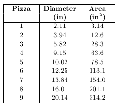
Table 1
Step 3. Enter your area vs. diameter data in Grapher using the instructions below.
Note that that's dependent, y vs. independent, x. Got that? This can be confusing. You'll put the variable that you're controlling, the independent variable, in the first column, and the variable that changes according to the relationship under study, the dependent variable, in the second column. When you use the "vs." terminology it's dependent vs. independent. This is just by convention.
-
aOpen Grapher.
-
bClick anywhere other than in the data table and then click in the first cell. Type 2.11. There are two ways to efficiently move from cell to cell while entering data.
-
•Click the Tab key after entering each value to fill in one row at a time.
-
•Click the Enter key after entering each value to fill in one column at a time.
-
-
•Click Tab and type 3.14 in the y-column. Click Tab again to return to the x-column. Continue in this way for the first five rows of data.
-
•Tab if necessary to get to the x-column in the sixth row. Type 12.25 and hit Enter. You're still in the x-column, but down a row. Enter 13.84 and continue to complete the x-column.
-
•Click in the first empty cell in the y-column and begin finishing that column using Enter after each entry.
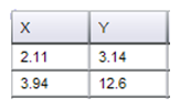
Figure 2
Step 4. Plot the graph. For this data, the process is easy. Click the Auto button. The data will be plotted using Grapher's suggested axis ranges. The graph should look pretty good with no adjustments necessary.
The graph shown in Figure 3 is what you want for your finished product. Your graph shouldn't look much like this yet. Here's a description of what you want, followed by how to achieve it.
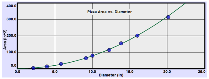
Figure 3: Pizza Area vs. Diameter
-
•include a title that describes the experiment. You can also include other identifiers like figure numbers, the lab name, etc.
-
•fill the allotted space.
-
•be properly scaled. The scale of each axis should be uniform and linear.
-
•start at zero on each axis. Occasionally we'll deviate from this, but with care.
-
•include axes labeled with the name and unit for the quantity plotted.
-
•include carefully plotted data points surrounded by point protectors. (Large circles in our case.) To change the size of the point protectors, right click on the graph and choose small or large points. . (Grapher's point protectors are of fixed size of no statistical relevance. They just make the location of the data points visible. Maybe in a later version...)
Line of Best Fit:
-
aIf the data is non-linear, draw a smooth curve indicating the tendency of the data as shown in Figure 3. (In some cases you won't be able to do this with Grapher, but you can print out a copy and draw the smooth curve by hand if necessary.) For non-linear data, you will usually need to linearize it to find the correct relationship as discussed below.
-
bIf the data appears to be linear, include a line of best fit indicating the tendency of the data. The data points should never be connected by straight line segments.
-
cIt is not important to hit any of the data points exactly. This includes the (0, 0) point. The line or curve is a sort of averaging of the data.
-
dWhen determining the slope of a linear graph by hand, include a pair of points on the line used in making the calculation. These should not be data points unless they happen to be on the line.
-
eDo not do calculations on your graph.
-
aClick in the text box at the top of the graph that says "Title" by default. You can edit this text to create your title. Usually this title indicates what's plotted in "Ordinate vs. Abscissa" format. But you can add figure numbers, lab name, etc. You can click in this text area and drag the title around as needed.
-
bBecause you clicked the Auto scale button, your graph should have been plotted so as to fill the space available. This system isn't foolproof, but it works pretty well. It will do nicely with this data set.
-
cIf either axis doesn't start at zero, or needs some other adjustment, click the Manu(al) scale button (Figure 4). Enter X MAX, X MIN, Y MAX, Y MIN values (Figure 5) to produce graph scales starting at (0, 0), and ending with values that lets the data fill most of the graph. The X MAX and Y MAX values should be chosen to make the graph easily readable. Clicking Submit will re-plot the graph with your new settings.
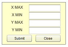
Figure 4
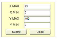
Figure 5
-
dClick Close.
-
eYour data is best summarized by your smooth curve or line of best fit. So once you create a line or curve, the data is no longer of any importance. To find the slope of a line by hand, pick two points on the line, as far apart as possible, and calculate theΔy/Δx.The slope should include units.
-
fYour graph is probably much taller than the one shown in Figure 3. It's often convenient to reduce its height. For example you may be asked to print out a graph and attach it to your lab report. A smaller graph is usually preferred. You can easily reduce the graph to one half or one third of its initial height. Try this. Click in the check boxes beside "2" and then "3" to see how this works. That's how Figure 3 was produced.

Step 5. Determine an equation relating area and diameter. We'll examine that process now.
2.1.2 – Creating an Equation by Linearizing Data; Using RMSE
You can often determine the relation between your variables and create an equation describing your data by a process called linearization. This is probably new to most students and it takes a bit of practice. The idea is to pick one variable and change each value in the same way—square each one, take the square root of each one, etc. If a plot using the new altered data is linear, you can then write an equation iny = mx + b
format to describe your data.
For example, if you found that a plot of y vs. x2 was linear, then y = mx2 + b
describes the relation between y and x. The slope and y-intercept of your graph can then be used for m and b in the equation, and you're all set. We'll see how to do this with an example and learn to use the "Linear Fit" tool in the process. The finished product should look like Figure 6.
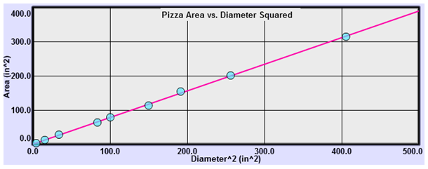
Figure 6: Pizza Area vs. Diameter Squared
a
In Grapher, add Graphs 2 and 3 by clicking the check boxes below the data table (Figure 7).
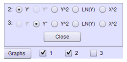
Figure 7
b
Click the Graphs button to display the choices of the modifications to do for your second graph. Let's try them all. You're looking for a choice that will make Graph 2 linear. The default selection is Y', the derivative of y with respect to x. (Don't panic; you'll learn about that one later, and no calculus is required.)
Note:
After making each choice discussed below, click Auto to reformat the graph to display all your data.
After making each choice discussed below, click Auto to reformat the graph to display all your data.
You now have a graph of y' vs. x. It's not too bad but let's move on. Y'' is already plotted by default in Graph 3. Click its Auto button. This one's a mess.
Back to Graph 2, try Y^2. (Don't forget Auto.) Not good. Try the natural log of y, Ln(Y). Not good.
OK, now try X^2. This looks very good. Jump back to Y'. Nope, X^2 looks best. There are endless choices of functions but all the ones we need are among these choices or can be generated by hand.
So let's go with the X^2 graph. Graph 1 was a plot of area vs. diameter. Graph 2 is a plot of the area (ordinate) vs. the diameter squared (abscissa). Your points should now appear to be in a straight line that goes through the origin.
c
Click in Graph 2. Click the "Linear Fit" checkbox. The line should now pass through your point protector circles. Notice that some are centered more above the line and some more below. This is the nature of a line of best fit. You'll see graphs in the lab that look almost linear but are not so randomly arranged. This indicates that the graph might not be linear.
Drag across several of the data points on your graph. You'll see that a different line is created. The line of best fit is generated for just the points you've selected. Now click anywhere in the graph. Since there is no area selected, Grapher assumes that you mean to use all the data.
d
Grapher will automatically calculate the slope and y-intercept of the line of best fit using a least-squares fit calculation. It will also display the RMSE value. The RMSE (root mean square error) value provides a measure of the average distance of your data points from the line of best fit.
Important Note:
If you move your pointer over each graph, you'll see that the "Linear Fit" box values will change to go with the graph that your pointer is in. Be careful to place your pointer in the correct graph! No clicking is required.
If you move your pointer over each graph, you'll see that the "Linear Fit" box values will change to go with the graph that your pointer is in. Be careful to place your pointer in the correct graph! No clicking is required.
Let's see what the RMSE can tell us about our y-intercept. With your mouse pointer near the origin of graph, zoom in once. Notice how close your graph comes to passing right through the origin. It's very close. Is it close enough to say, within the experimental uncertainty of this data, that the y-intercept could be zero? If it is, then you could say that the area of your pizza is directly proportional to the square of its diameter and drop the small y-intercept value. That is, is the area proportional to the square of the diameter or is it proportional to the diameter plus or minus a little nibble? Zoom back out.
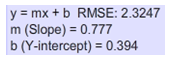
Figure 8
e
Write the equation in y = mx + b
form, where
You should never use the general variables y and x in your equations. Always substitute the name or first letter of each variable. With typical values from this data shown in the best fit data box in Figure 8,
But the y-intercept (.39) is quite a bit less than the RMSE (2.32), so the y-intercept is closer to the line than the uncertainty of your data you could say that it's essentially zero. So, there is no nibble! So our final equation is
Not y = 0.78x2.
2.2 – Interpreting Graphs
In the pizza example, we initially found this relation: Let's look at the two terms m and b. Calculating4 × m = 4 × 0.78
gives you 3.12, which looks a lot like π. Recalling that the area and diameter of a circle are related by
explains where the 0.78 came from. It's approximately π/4.
What about b, the y-intercept? Clearly a pizza of zero diameter should have zero area. This tiny bit of pizza (0.39 in2) is a result of the uncertainty in measurement of the pizza. We can't just ignore our data, but as discussed earlier, it is within the range of error in our data, so we can safely disregard it. As we'll see soon, this y-intercept will often have real physical meaning.
What we've found here is a common proportional relation—a quadratic proportion. While there are a huge number of possible relations, we'll find only a handful in elementary physics. In some of our labs, we'll be using a graphical approach to find or verify these relations, so let's learn to recognize the ones that are likely to come up.
2.2.1 – No Relation
The time for a satellite to orbit a massive body is referred to as its period, T. This time depends on surprisingly few factors. How about the mass of the satellite? Click the Clear button to empty your data table. (It may be hiding behind the Graphs button.) Enter the period vs. mass data from Table 2 into Grapher. (The Enter method is much better than the Tab method here.) Be sure to click the Auto button. Auto didn't work so well this time. Our graph doesn�t start at 0, 0. Let's use Manual scaling. Click Manu beside the top graph. Adjust as needed to produce Graph 7. You could use a different Ymax value if you like.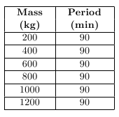
Table 2
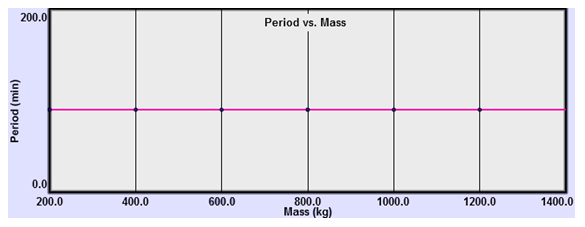
Figure 9: Period vs. Mass
2.2.2 – Linear Relation
An elastic object is one that stretches or compresses in a uniform way (up to a point called the elastic limit) as increasing amounts of force are applied to it. A spring is a good example. A rubber band is not so good an example as its elasticity changes as it's stretched by increasing amounts. In Figure 10, a spring from the Simple Harmonic Motion lab is shown hanging beside a meterstick which measures its initial length to be about 30.0 cm.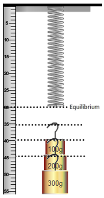
Figure 10: Stretch
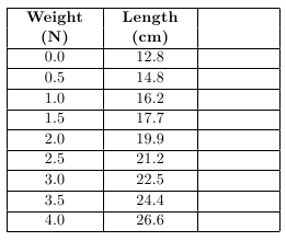
Table 3
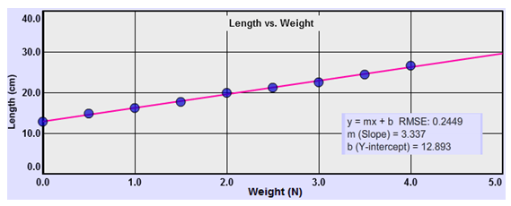
Figure 11: Length vs. Weight
2.2.3 – Direct Proportion
The equation we just found was somewhat determined by the way we set up the experiment. The spring's length was clearly changing so it was the obvious choice to compare to the weight. But if we had instead made measurements of the mass's position relative to its initial position, we would have been measuring the amount the spring stretched as weight was added. That seems closer to what a spring's behavior is all about. It's a simple matter to rearrange the equation to fit that view of the spring's behavior. Subtracting the y-intercept, which is just the spring's initial length, from both sides gives us or Now we're comparing two quantities that are directly related to each other—the stretch and the weight, or force stretching the spring. An extra column has been added below for you to record the stretch values by subtracting the spring's initial length from each length entry. Fill in those values and edit the Y column in Grapher. Just click on the 12.8 and type 0.0 and then click Enter. The next stretch value will be ready to edit. You'll notice how the data point adjust each time you hit Enter. After the last entry, you'll need to click in some other cell in the table to get the final point to adjust.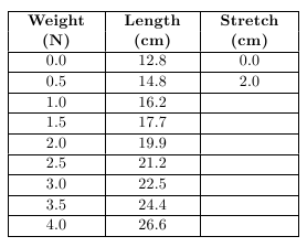
Table 4
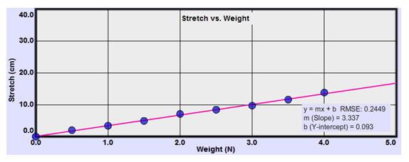
Figure 12: Stretch vs. Weight
Comparison of Linear Relation and Direct Proportion:
Note the contrast:
Note the contrast:
-
•In a linear relation, the dependent variable changes by a fixed amount for a fixed change in the independent variable.
-
•A direct proportion is also a linear relationship, but in addition we see that two quantities are directly proportional if they vary in such a way that one of the quantities is a constant multiple of the other, or equivalently if they have a constant ratio.
-
•A direct proportion implies a linear relation.
-
•A linear relation does not imply a direct proportion.
So don't look back at the data once you have your equation! Recall the similar statement about lines: "So once you create a line or curve, the data is no longer of any importance."
2.2.4 – Inverse Proportion
We found that in a direct proportion, multiplying the independent variable by a certain value will result in the dependent variable changing by the same factor. E.g., for a rectangle, area = length × width. Doubling the width will double the area. We'll also sometimes find the inverse of this relation where, for example, doubling one quantity will halve the other. Let's return to our pizza to find this inverse proportion. In that earlier analysis, we looked at how the area of the pizza increased with diameter. This called for more and more pizza. (A cause we can all get behind!) Times are hard now. Dough is in short supply. How can we continue to create the 20 inch pizzas we had earlier? From a given amount of dough you can create a pizza of almost any size, but as the size (area) increases, something has to give. That something is thickness. Let's assume our pizza dough comes in balls of diameter 4.6 in. Each one would then have a volume of For any flat (no rim stuffed with cheese!) circular pizza made with such a ball of dough, The graph of area vs. thickness in Figure 13 illustrates the nature of the inverse proportion. Since the product of the area and thickness is fixed, increasing one decreases the other by the same factor. That is, doubling the thickness halves the area, etc.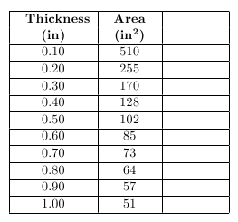
Table 5
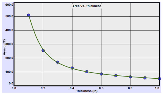
Figure 13: Area vs. Thickness
-
•The product of x and y equals a constant,k = x × y.
-
•x is directly proportional to the inverse of y:x =or
k y x ∝
.1 y
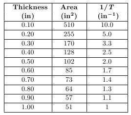
Table 6
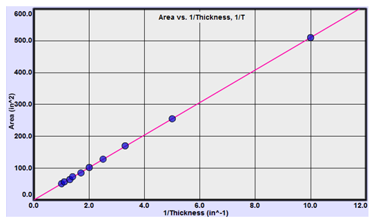
Figure 14
2.2.5 – Square or Quadratic Proportion
There are two different situations where we encounter quadratic proportions.-
aUpward-opening parabola The dependent variable is directly proportional to the square of the independent variable.
-
bSide-opening parabola The square of the dependent variable is directly proportional to the independent variable.
Figure 3: Pizza Area vs. Diameter
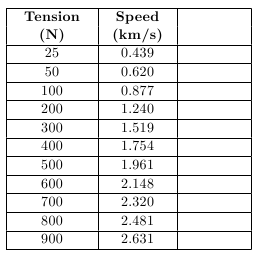
Table 7
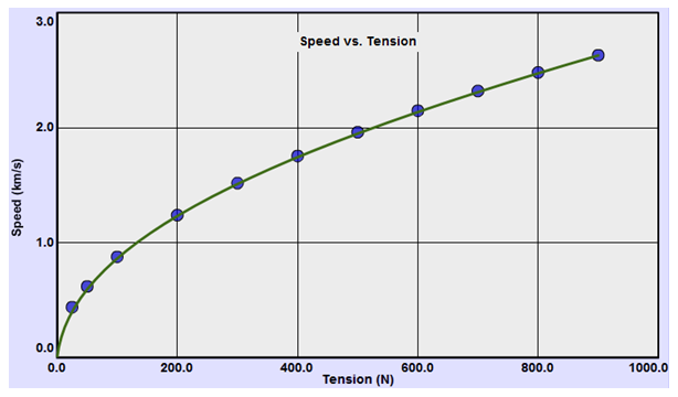
Figure 15: Speed vs. Tension
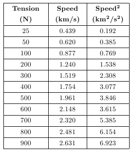
Table 8
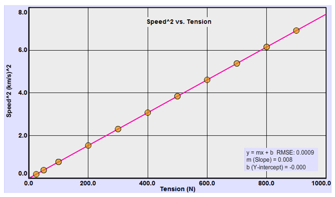
Figure 16: Speed vs. Tension
(y = kx)
and noting that the y-value is v2,
gives us
This is again the equation of a parabola. This time we have a side-opening parabola. This is the nature of the graph of
2.2.6 – A Summary of Mathematical Relationships and Related Graphs
We'll see relations 2–5 modeled in the lab. Relations 6–7 will likely be seen in class. You'll want to refer back to this chart as you work with the data in your labs.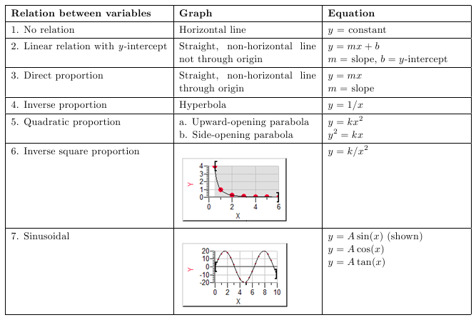
3 – Capturing Graphs and Sketches for Uploading in WebAssign or Printing
Most of the labs include a Screenshot tool which is used for capturing and saving images of parts of the apparatus, graphs, and figures. In some labs you'll also create sketches right from the apparatus. You'll upload these images into WebAssign and sometimes print them out to paste into your lab reports. The method works the same for sketches and graphs. In both cases you'll take a Screenshot of some part of the lab apparatus or Grapher. We'll first look at the Screenshot tool. Then we'll look at a typical example of creating sketches.3.1 – Uploading Graphs and Sketches for Grading Using the Screenshot Tool
A Screenshot can be taken from Grapher or any lab apparatus that includes the Screenshot tool icon. There are two steps to uploading a screenshot.-
•Take a Screenshot and save it locally to your hard drive, a thumb drive, or similar.
-
•Upload that local file from within the lab you're working on in WebAssign.
1
Take a Screenshot and save it locally to your hard drive, a thumb drive, or similar. Here's how.
-
aStart the Screenshot process by clicking the Screenshot icon which is a small camera image,
 .
.
-
bYour mouse pointer will change to a cross-hair,
 .
Without clicking, move it to the top-left corner of the area you want to capture. Click and drag to the bottom right corner of the capture area and release. (You can actually use any two diagonally opposite corners.)
.
Without clicking, move it to the top-left corner of the area you want to capture. Click and drag to the bottom right corner of the capture area and release. (You can actually use any two diagonally opposite corners.)
-
cWhen you release the mouse button a file requester will pop up. Navigate to wherever you want to save your captured image and change the default name to the name suggested in the lab. Be sure to include the ".png" at the end. Use "test.png" or similar for this example.
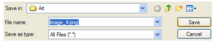
Figure 17: File Requester
Note:
When you're asked to create a Screenshot you'll also be provided a filename to use so that you can easily keep track of these files. For example, in one lab you'll be asked to "save it as "Vel_IB1a.png" and then upload it." You'll save the file locally with that name. You can actually create these image files anytime you like and upload them to WebAssign as needed.
When you're asked to create a Screenshot you'll also be provided a filename to use so that you can easily keep track of these files. For example, in one lab you'll be asked to "save it as "Vel_IB1a.png" and then upload it." You'll save the file locally with that name. You can actually create these image files anytime you like and upload them to WebAssign as needed.